Logos & Cake
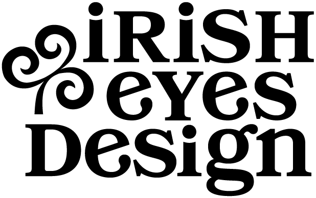
No color & it still reads as me.
Every designer has a thing they say to nearly every client without meaning to. The explanation that comes out the same way, project after project, because it's true. My analogy is with cake, and it's the easiest way I know to explain why logo design matters.
The Cake Test
Have you ever gone to a party where you notice the cake on a table and it’s gorgeous? You’re finally served a piece of that cake, and you’re disappointed: it’s dry and bland, and the frosting, though beautiful, is pure hardened sugar, rendering it inedible. Well, logos are like that cake. It doesn’t matter how pretty the cake is; if the cake itself doesn’t taste good, why even bother adding the frosting?
A logo has to hold up as a strong form in black and white, in any application, before color ever gets involved. Color is the frosting; it may bring your logo to life, but it can't fix a structure that isn't sound underneath.
Why Foundation Beats Decoration
A logo that only works in your brand colors is a logo that's already in trouble. It has to survive being embroidered on a shirt, stamped in foil on a card, shrunk down to a favicon, or printed in plain black ink by a vendor who doesn't carry your exact color match. None of that is a color problem. It's a form problem, and no amount of frosting fixes a shape that doesn't hold up on its own.
How to Know If Yours Passes
A few honest questions, if you want to run your own logo through the cake test:
Does it still read clearly in plain black and white?
Does it still work at the size of a favicon, not just a banner?
Could you describe it to someone without mentioning a single color?
If you hesitated on any of those, the frosting has probably been doing more work than the cake.
Where I Come In
I can usually see whether a logo's foundation is solid before I know anything about the color palette it's supposed to carry, and it's not a party trick; it's just what happens when you've created enough logos to know the difference between a strong shape and a well-decorated one.
If you're not sure your logo would pass the cake test, let's talk. You can be sure I’ll be honest!
Aurelie Gallagher is the designer behind Irish Eyes Design, a boutique graphic design studio serving small businesses and entrepreneurs. She specializes in brand identity and print design as well as Squarespace websites, and she believes that great design starts with knowing yourself first.