I Have Opinions

Here's the thing about design: everyone has an opinion on it. Your cousin, your neighbor, the guy at the coffee shop; they all know what they like when they see it. And that's fine. That's art being art. But design isn't art, not exactly.
Art is subjective; design solves a problem.
And once you start looking at design through a problem-solving lens, "I just don't like the blue" stops being the end of the discussion and starts being the beginning of an important conversation. Why doesn't it work? Is there too much or too little blue? Is it how it makes you feel… Do you see what I mean? These questions matter! Often, our first question should be, “What problem is the design actually trying to solve?” and then, “Is it doing it?”
After you’ve asked the initial questions about purpose, that’s when design principles come in. These principles are the difference between a layout that just sits there and one that actually does its job.
A Few Basic Principles of Design
1. Balance
Balance is what keeps a design from feeling like it's about to tip over. It's the visual weight distributed across a page so no single element bullies the rest into the corner.
Symmetrical balance mirrors elements across an axis; think formal, traditional, steady. Asymmetrical balance is trickier and, frankly, more interesting; it uses elements of different sizes, colors, or weights to create a pull that still feels even, even though nothing is mirrored. It's the design equivalent of a well-placed counterweight.
Proper distribution matters here too, and not just in terms of placement. Texture plays a role: a heavy block of color, a dense pattern, or a busy photo all carry visual "weight" the same way size does. A small textured element can balance a large flat one, which is part of what makes asymmetrical layouts work without feeling lopsided.
And then there is white space: it is your friend! When you balance white space with information, the information becomes readable.


2. Alignment
Alignment is the principle that quietly connects everything. Nobody compliments good alignment, but everybody notices when it's missing.
Every element on a page, the text blocks, images, and icons, should connect to something else, whether that's another element or the edge of the page itself. When things line up, a design feels intentional, cohesive, and calm. When they don't, it feels like chaotic clutter. The viewer rarely sticks with a cluttered design even if all the information is there; a chaotic layout doesn’t actually solve your problem (even though it might be artsy).

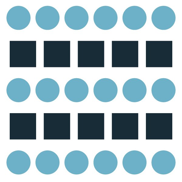
3. Repetition
Repetition is what turns a single piece into a system, and a system into a brand. Any time you repeat something, you are adding emphasis, whether you intend to or not.
Repeating a color palette, a font pairing, or a graphic motif across multiple pages or pieces builds familiarity. It tells the viewer, consciously or not, that everything they're looking at belongs together. This is a big part of what makes a brand feel like a brand instead of a loose collection of pretty things.
In this blog post, I’ve used my brand colors for all of my examples.
4. Contrast
Contrast creates visual interest, adds emphasis, and makes the layout interesting. This shows up as light against dark, a massive headline next to small body copy, or a bold shape dropped into a field of soft ones. Sometimes contrast whispers, and sometimes it screams.
White space plays a part here, too. Have you noticed there is overlap in these basic principles? They really do work together!

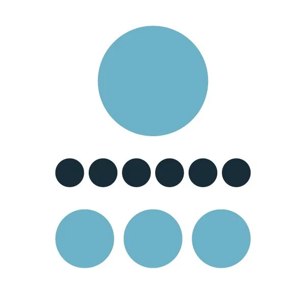
5. Hierarchy
Hierarchy is the principle that does the heavy lifting of "read this first."
By adjusting size, weight, color, and placement, the designer creates a path through the information; most important to least important, without ever having to say so out loud. Good hierarchy means a viewer can skim a page for ten seconds and still walk away with the right takeaway.
So, About Those Opinions
None of this means your opinion doesn't matter; it absolutely does, especially when it's your brand. However, there's a difference between "I don't like this" and "This isn't working, and here's why." The principles of design turn a subjective reaction into something to talk about, adjust, and solve.
That's the work a designer does: creative problem solving. Some days design is pretty, and sometimes it is utilitarian. It’s like the difference between a rhombus and a square: a square is always a rhombus, but a rhombus isn’t always a square. Good design might be art, but art isn’t always design.
If your marketing materials aren't reaching your audience as intended, assess the design itself. With the accessibility of design tools, many seem to think, “I can do this myself.” But if you’re not hitting your mark, let’s connect and assess. Start with the question, “What’s the problem I’m trying to solve?” Then filter in some principles before your opinions…or mine.
Aurelie Gallagher is the designer behind Irish Eyes Design, a graphic design studio based in the greater Chicagoland area, working with clients everywhere. She specializes in brand identity, print design, and Squarespace websites.